#1 Depth of Field vs Material
“The fundamentals of light, surface, and movement are key to conveying how objects move, interact, and exist in space and in relation to each other. Realistic lighting shows seams, divides space, and indicates moving parts”
– Google
“Depth. Visual layers and realistic motion impart vitality and heighten people’s delight and understanding.”
– Apple
Google and Apple have very different schools of thought when it comes to the interactions with their devices and applications.
Google has been inspired by the flat design movement and believes that humans should interact with their components as if they were sheets of paper stacked on top of each other. The depth is tactile and makes the user feel that they are holding each screen in the palm of their hand. An example of this would be their card components (shown to the right). Imagine them as “pieces of paper” sitting on the flat background of your phone.
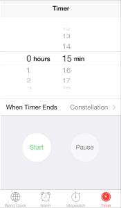
Apple believes that mobile devices should be seen as a window in to another world. They embrace infinite depth in their applications and use components such as their alert buttons and text messages with blurred background to create the feeling that the items are floating and exist in their own space. Another example of this would be the click wheel for their timer. See how the numbers recede in to the background? That would never happen in material design.

#2 Stance on Animation
“Just as the shape of an object indicates how it might behave, watching an object move demonstrates whether it’s light, heavy, flexible, rigid, small or large. In the world of material design, motion describes spatial relationships, functionality, and intention with beauty and fluidity”
– Google
“Add animation cautiously, especially in apps that don’t provide an immersive experience. Animation that seems excessive or gratuitous can obstruct app flow, decrease performance, and distract users from their task.”
– Apple
Among the biggest differences between the two schools of design, Google and Apple have very different views on the purpose of animation.
Google sees animation as a way to enhance user experience and give life to their components. This is by far a much more humanist stance than Apple has about animation. Google uses unique animation to express the type of “material” you are interacting with. An example of this would be re-organizing cards. The animation would make it appear that you are rearranging cards of paper. Or if you slide down to refresh the google chrome page it bounces as if created with rubber. This idea is essential to material design.
Apple has a no nonsense approach to animation. They believe that animation should only get you from A to B without distracting the user from the real content. Where Google tends to lean on the humanist side, Apple tends to lean on the inorganic side. As I said before, they want to create a window in to a new world, not reference motion from everyday life that would otherwise deter users from the tasks their user is trying to complete. An example of this would be Apple’s slide left and slide right on the ios navigation. They don’t bounce or bend, they slide with rigidity and focus.
#3 Navigation
“Your app’s structure should be organized according to the content and tasks you want users to see. Focus attention on important destinations by placing them in tabs or side navigation. Alternatively, de-emphasize inessential content by placing it in less prominent locations.”
– Google
“People tend to be unaware of the navigation experience in an app unless it doesn’t meet their expectations. Your job is to implement navigation in a way that supports the structure and purpose of your app without calling attention to itself.”
– Apple
Google has loose rules for navigation and thus gives designers more flexibility for customization. However, this makes it a bit more strenuous for users to grasp the navigational patterns of an application. Google believes that navigation should be obvious and that it can be in many different places. You can use a variety of components such as: action buttons that reveal options, cards that lead in to pages similar to the concept of a dashboard, using tabs, and even highlighting sections by using color coding with icons on a list view.
Apple uses a very simple navigation system that is easy for all users to understand. They use a “tab bar” that is attached to the bottom of the screen with an app’s main functions. Usually containing no more than 5 main functions, a hamburger icon is sometimes listed on the tab bar for less important navigational items, as is the case with the the apple music application. The idea that an app should have no more than 5 main functions forces designers to think carefully about their app’s features (I mean, you only get 5!). Apple also uses “tabs” like Google’s material design spec, but instead uses a component called “segmented control”. Allowing only up to 3 segmented controls maximum again restricting the user and designers options.
Also, Google and Apple’s view differ greatly when it comes to the use of the hamburger icon. Google often uses the hamburger menu for their primary navigation. Once you click on the hamburger it opens up a “drawer” as they call it or conversely a “side nav” for apple. This drawer often times contains a profile picture of the user, login options, profile name and an icon based list of the primary navigation. However, Apple disagrees with this sentiment as believes that primary navigation elements should be present in the foreground and that the hamburger should be used only as a place to store functions that are not daily tasks performed by the user. Apple uses their side nav function to store items they would like out of site by the user. (ex: iOS facebook’s hamburger opens up a side nav that contains preferences and chat details) They do this so users are not distracted by options and have a focused path ( via the bottom tab bar) to follow to get primary functions completed by users.
Conclusion
Overall, both of these companies have an extensive belief system when it comes to the ethos of their applications. Apple tends to have users go straight to the facts and leave any distractions like animation to the wayside. The are practical minded and delight users by using infinite depth and blur effects in iOS. On the other hand, Google’s material design standards lean on the humanist’s side of design. They believe in creating a tactile OS experience that makes you feel like your are holding each screen in your hand. They delight users by using animated techniques that users can relate to every day objects. Navigation is more straightforward for Apple, while Google believes that as long as you make the navigation clear you’re in the green. Both companies are major stars in the arena of user interface design and it is exciting to see how these two schools of design will evolve.
References:
https://developer.apple.com/library/ios/documentation/UserExperience/Conceptual/MobileHIG
https://www.google.com/design/spec/material-design/introduction.html


